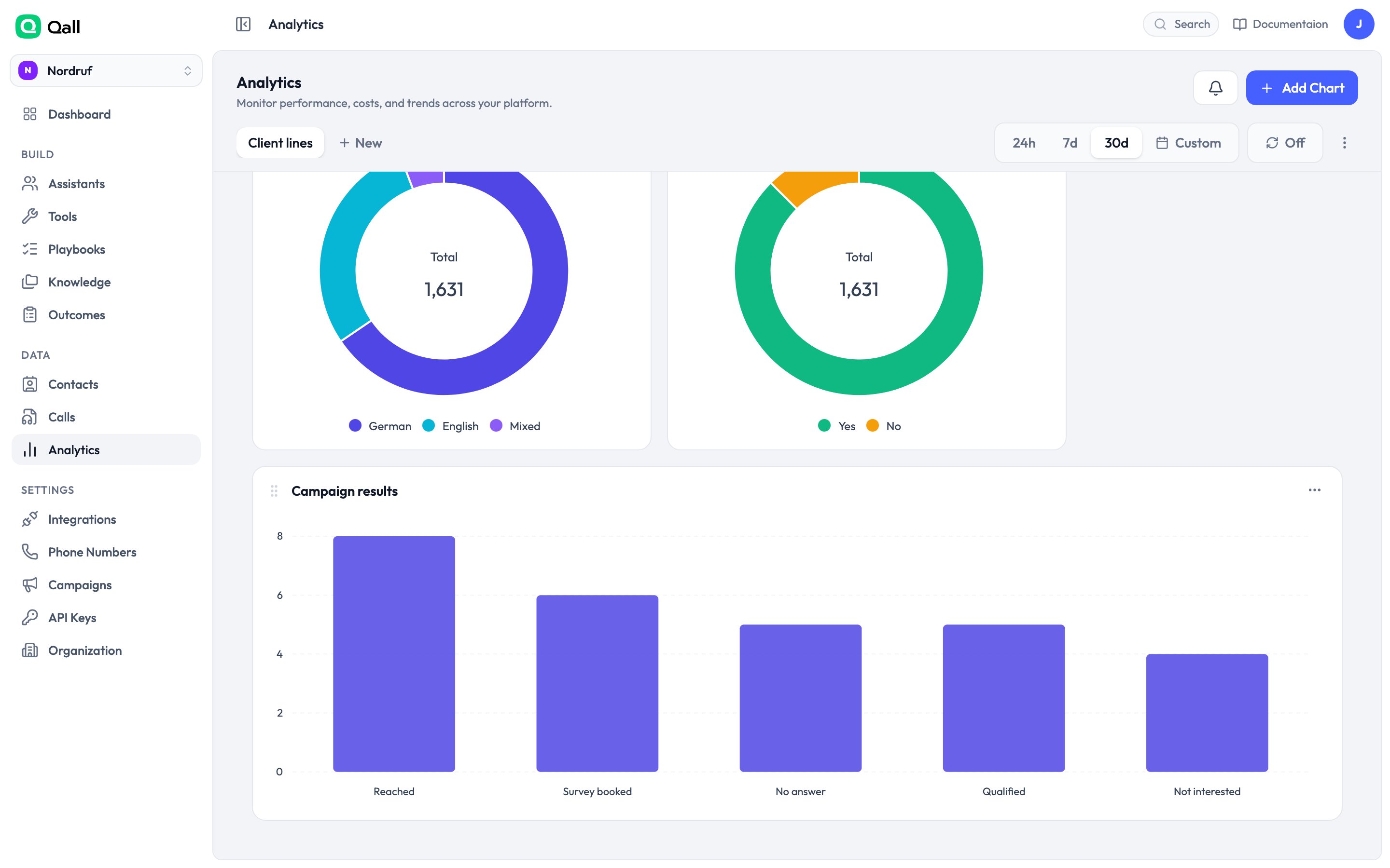
Build charts over what your assistants have been doing, arrange them on dashboards, and export the numbers.
An analytics dashboard

An analytics dashboard.

Building a chart

Click Add chart and choose what you’re counting.
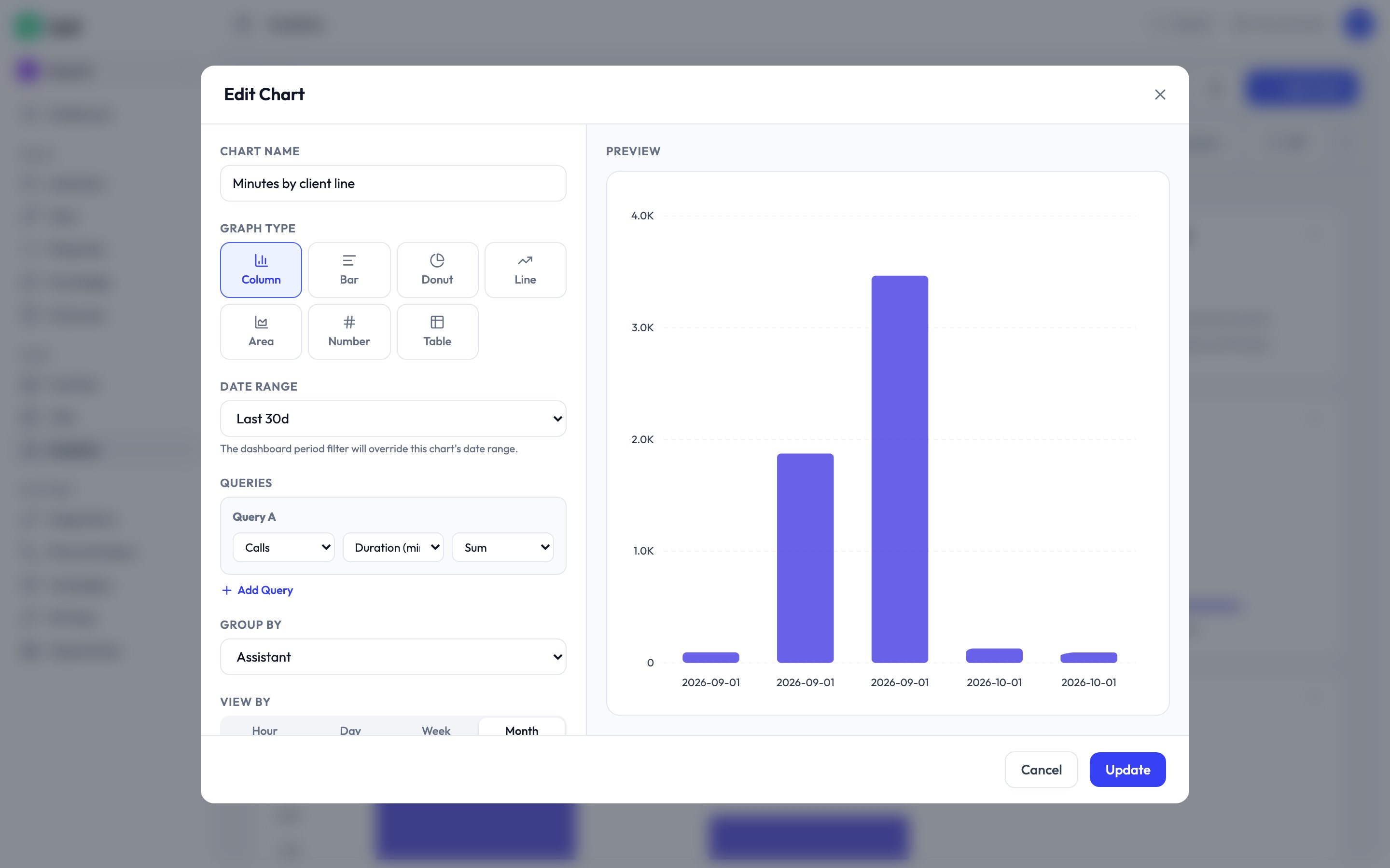
The chart builder

The chart builder.

1

Pick what to measure

Choose a source and a figure — total minutes, number of calls, cost.
2

Break it down

Group by assistant, by day, by how the call ended, by outcome. This is what turns a number into an answer.
3

Filter

Narrow to one assistant, one direction, calls over a certain length.
4

Choose how it looks

Column, bar, line, area, donut, a single number, or a table.

What you can chart

Questions worth asking

Where do callers give up? Chart playbook runs grouped by stopped at step. The tall bar is the step to rewrite. What are people actually calling about? Chart calls grouped by your call-reason outcome. What’s it costing per line? Chart cost grouped by assistant, over 30 days. Is it getting better? Put total calls and resolved-on-the-call side by side and turn on compare to previous period.

Dashboards

Charts live on dashboards. Drag them to rearrange, and set a period for the whole board — the last 24 hours, 7 days, 30 days, or a range you pick. Duplicate a dashboard to make a variant without rebuilding every chart.

Exporting

Any chart exports as CSV, with the rows behind it rather than the picture.