> ## Documentation Index
> Fetch the complete documentation index at: https://docs.qall.io/llms.txt
> Use this file to discover all available pages before exploring further.
# Analytics
> Charts over your calls, costs, outcomes and procedures.
Build charts over what your assistants have been doing, arrange them on
dashboards, and export the numbers.
 ## Building a chart
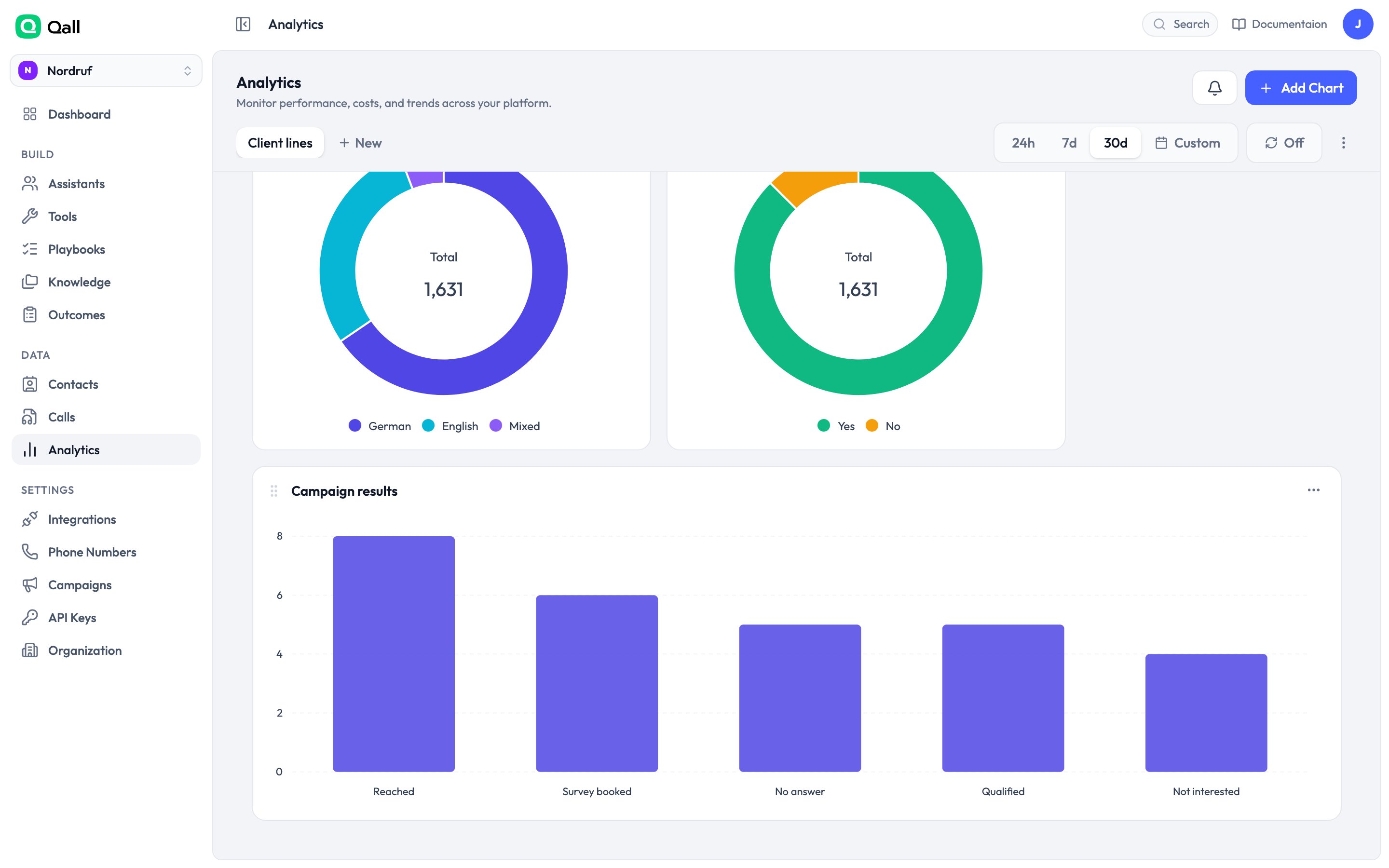
Click **Add chart** and choose what you're counting.
## Building a chart
Click **Add chart** and choose what you're counting.
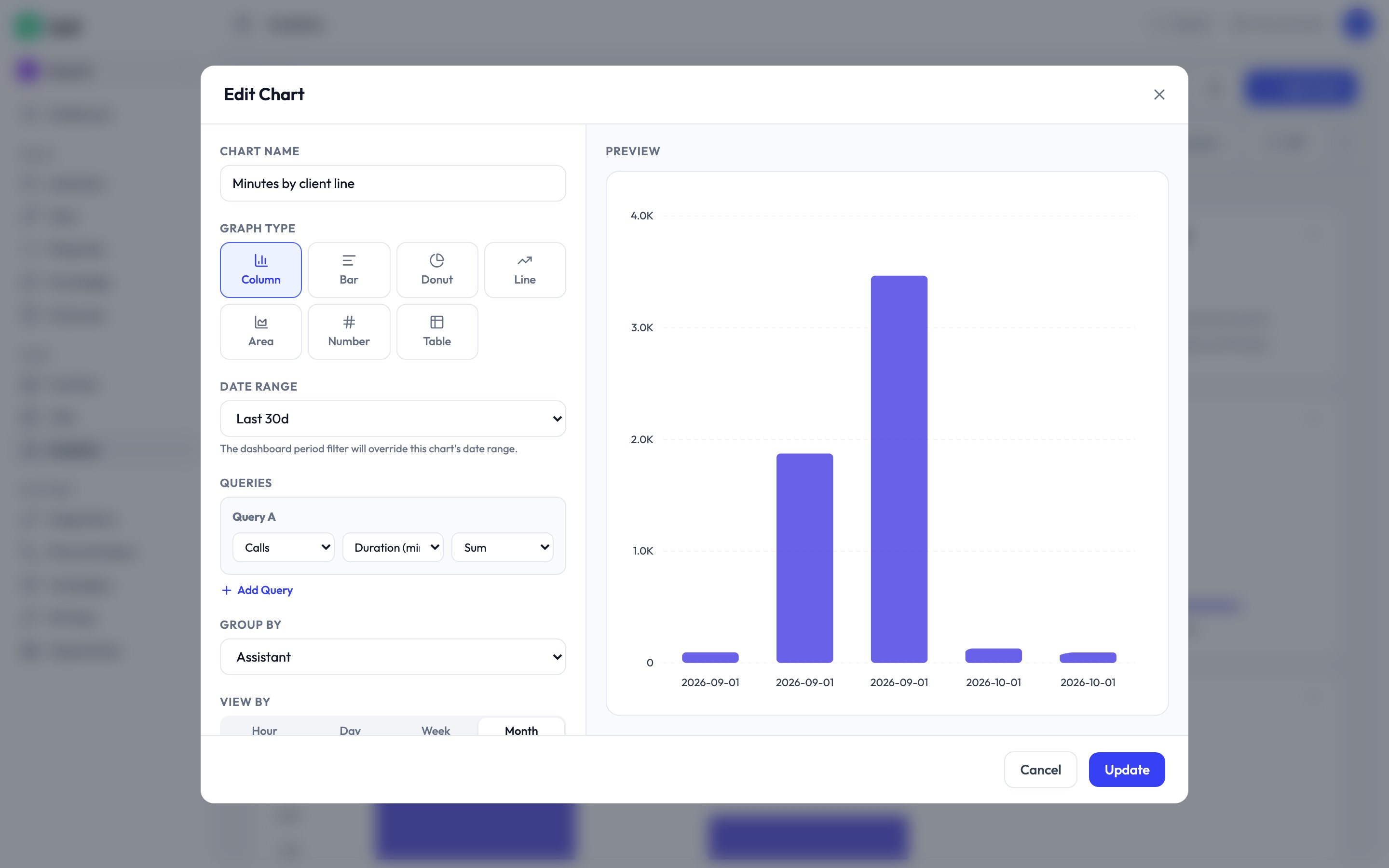 Choose a source and a figure — total minutes, number of calls, cost.
Group by assistant, by day, by how the call ended, by outcome. This is what
turns a number into an answer.
Narrow to one assistant, one direction, calls over a certain length.
Column, bar, line, area, donut, a single number, or a table.
## What you can chart
| Source | One row per | Good for |
| - | - | - |
| **Calls** | Call | Volume, duration, cost, who talked more, which models were used |
| **Daily summary** | Day, assistant and direction | Trends over weeks — faster than Calls for the same question |
| **Campaigns** | Campaign | Attempts, answered, connect rate, voicemails, consent |
| **Playbooks** | Procedure run | Steps completed, and where callers stop |
| **Outcomes** | Call and outcome | What was recorded, as name and value |
## Questions worth asking
**Where do callers give up?** Chart playbook runs grouped by *stopped at step*.
The tall bar is the step to rewrite.
**What are people actually calling about?** Chart calls grouped by your call-reason
[outcome](/outcomes).
**What's it costing per line?** Chart cost grouped by assistant, over 30 days.
**Is it getting better?** Put total calls and resolved-on-the-call side by side
and turn on **compare to previous period**.
## Dashboards
Charts live on dashboards. Drag them to rearrange, and set a period for the whole
board — the last 24 hours, 7 days, 30 days, or a range you pick.
Duplicate a dashboard to make a variant without rebuilding every chart.
## Exporting
Any chart exports as CSV, with the rows behind it rather than the picture.
This documentation is built and hosted on [Mintlify](https://mintlify.com), a developer documentation platform.
Choose a source and a figure — total minutes, number of calls, cost.
Group by assistant, by day, by how the call ended, by outcome. This is what
turns a number into an answer.
Narrow to one assistant, one direction, calls over a certain length.
Column, bar, line, area, donut, a single number, or a table.
## What you can chart
| Source | One row per | Good for |
| - | - | - |
| **Calls** | Call | Volume, duration, cost, who talked more, which models were used |
| **Daily summary** | Day, assistant and direction | Trends over weeks — faster than Calls for the same question |
| **Campaigns** | Campaign | Attempts, answered, connect rate, voicemails, consent |
| **Playbooks** | Procedure run | Steps completed, and where callers stop |
| **Outcomes** | Call and outcome | What was recorded, as name and value |
## Questions worth asking
**Where do callers give up?** Chart playbook runs grouped by *stopped at step*.
The tall bar is the step to rewrite.
**What are people actually calling about?** Chart calls grouped by your call-reason
[outcome](/outcomes).
**What's it costing per line?** Chart cost grouped by assistant, over 30 days.
**Is it getting better?** Put total calls and resolved-on-the-call side by side
and turn on **compare to previous period**.
## Dashboards
Charts live on dashboards. Drag them to rearrange, and set a period for the whole
board — the last 24 hours, 7 days, 30 days, or a range you pick.
Duplicate a dashboard to make a variant without rebuilding every chart.
## Exporting
Any chart exports as CSV, with the rows behind it rather than the picture.
This documentation is built and hosted on [Mintlify](https://mintlify.com), a developer documentation platform.